Tuesday, February 28, 2006
The Cost of Art
I went to Michael's today and spent $25 on a really expensive sable brush, one tiny tube of Windsor Newton Hooker's Green and some cheap arcrylic paint that I need for a poster painting project at temple. Being an artist is expensive. A classmate at Fullerton College conviced me that I needed a good sable brush to do the flatwashes correctly. My current brush set is mostly good synthetic and ox hair. The sable is the top of the line. It is supposed to hold paint better in the natural fibers. Sable is like the mink coat of art brushes. How they make them is supposedly really awful, like the making of fur coats. I did buy just one to see if it is truly better than the synthetic brushes I depend on now. We will see if my flat washes improve...
More photoshop
Practice Flatwash
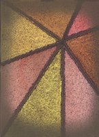
I worked on this as a practice of flat washes in class on Saturday. You can see that teh colors are 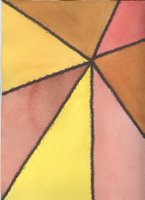 very similar to the earth tone OM. These are really some of my favorite colors. Every color is a combination of Scarlet, Yellow and Burnt Umber. It does not complete the assignment becasue there are not 12 flat washes. I just wanted to practice with a design rather than just do random flat washes.
 very similar to the earth tone OM. These are really some of my favorite colors. Every color is a combination of Scarlet, Yellow and Burnt Umber. It does not complete the assignment becasue there are not 12 flat washes. I just wanted to practice with a design rather than just do random flat washes.
Monday, February 27, 2006
Plastic Wrap Filter!?
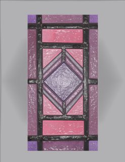
This is an odd Photoshop Filter that I've NEVER used before called Plastic Wrap. It looks like the art has been shrink wrapped. How odd. But I sort of LIKE IT. This is very unusual. It makes the art look like it was created out of some sort of plastic clay rather than watercolor which is kind of neat. Oh well, you can voice your opinions.
I made some greeting cards with the plastic wrapped version of this piece and my eight-year-old daughter thought they were really nifty. These are HER colors. Her room in Ohio was painted this pink and she has plenty of purple in her room.
Incidentally, the other FLW Stained glass looks like crap with the plastic wrap filter. I think it works on this piece becasue the colors are very candy coated and plastic-like to start off with. I've been wondering all afternoon who invtented this plastic wrap fiter...why did Adobe pay someone to create this odd filter?...who else has used it and for what purpose? I would love to know.
Marshall did remind me on Saturday that his class is NOT a photoshop class. But he did admit he liked Blue Green Cubism better with the Glass Filter...OH, Well...
Pink Stained Glass
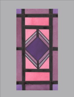
My washes are nearly flat enough here...but the black lines still lack some symetry. I want to go back to doing the cubist style paintings and drop the fussy look of these Stained Glass attempts. I did pink and purples purely for some variety...and I had the colors in Cotman paint and I'm sick of using expensive Windsor Newton paint on this homework. This painting is not my usual style...I really am not that into this. I may actually turn this one in because I don't know if I have the energy to do another stained glass.
Frank Lloyd Wright Inspired Stained Glass
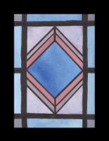
OK...I'm getting really sick of the Stained Glass Project. My washes are still not flat. My black lines are not perfect. I'm really losing patience with this assignment and I need to have something good by next Saturday. This does look similar to a stained glass window and I think that is largely because the washes are NOT flat. Ho hum. I really am a bit intimidated by how good some of the pieces are that my fellow students are doing...but they aren't all producing perfect flat washes either.
Sunday, February 26, 2006
Flower Fabric Design
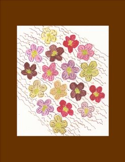
This is something that I painted last spring in Cleveland at my Community Center Class. I just found it in my office and it struck me as fun and I wanted to share it. I painted a lot of flowers in Cleveland and I'm not painting them as frequently any longer. I think I was looking at a seed catalog when I painted this, not actual flowers. It is very abstract. I used cotman paint and mutlicolored fine line sharpies to do this piece. It is from 2005, so it is very out of order on the blog. I hope you find it fun.
Saturday, February 25, 2006
Earth Toned OM
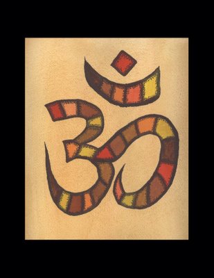
This is what I painted in Watercolor Class Today at Fullerton College. I just felt like doing another OM. This would make a really cool T-Shirt Design. Maybe I should order some of that T-Shirt transfer paper that you can run through an ink jet printer. This piece is not photoshoped. I just added the Black Border in MS Publisher. I really need to do another Stained Glass piece with Flat Washes. My instructor is still not happy with my flat wash technique. I really do not mind practicing the flat washing, but the Arches all cotton paper is expensive. So is the paint I am using now. Look for more posts next week.
Friday, February 24, 2006
Greeting Cards For Sale
I can make very nice greeting cards out of anything on the Blog...A dozen cards will cost you one tube of Windsor Newton professional grade paint or $10 (This is cheaper than buying mass marketed cards) - See www.cheapjoes.com for my Wish List of Paint Colors. Ode to Yoga makes an especially nice greeting card. Blue Green Stained Glass with the Glass Filter also looks superb as a greeting card. In your dozen cards you may select any six paintings...so you can get a lot of variety. Most of the art looks very nice printed as blank all purpose greeting cards. Just e-mail me your order and I'm happy to fill it. You will have to snail mail me a check so first e-mail me at linda.s@adelphia.net
Ode to Yoga: OM Stained Glass
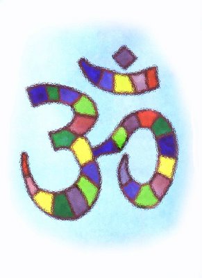
This is an OM sign that you find in all Yoga class rooms. It is a point of meditation that stands for the practice of chanting OM in Yoga classes. I've been taking Yoga on and off for 15 years. I'm in an Iyengar Yoga Class right now. This piece was painted in the Watercolor Stained Glass Style for my Painting class. When scanned it turned out really dark so I used Curves in Photoshop to adjust the colors. This looks very different from the orignial color of the painting. I also used the glass filter. I really like this BETTER than the original painting. I truly love Adobe Photoshop, even though I'm not a master at the software.
Thursday, February 23, 2006
Art and Mental Health
Since this is supposed to be a blog on the influence of art on my mental state I might as well report on that. I am feeling very up and down with my bipolar disorder lately. The art does have a calming effect on my mental state. About one day every week or so is very dark for me. I can not really predict why this is. I'm on a very high dosage of Trileptal, on a moderate dose of Geodon and a wee dose of Lexapro right now. My anxiety level is pretty good. I do still take a small amount of Lorazapam for anxiety. Intermitent depression is my current problem. It is debilitating on the days it happens. Like I said, most days are good. And I'm not an anxious wreck like I was in 2004. I'm not totally manic like I was in 1998. I don't know really WHY the deeply depressed days happen. I don't want to take MORE meds...but I may. Who knows how to control this strange disease. I only know the art does help...
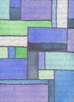
Glass Filter on Blue Green Cubism
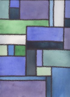
This is my favorite filter on the Blue Green Cubism. It is the Adobe Photoshop Glass Filter. I really like this. A woman named Monica - who I don't even know - who lives in the Chicago area made a comment that she likes the Blue Green Cubism. I'm really thankful that people from outside my circle of friends and family are finding the blog enjoyable. This is very good for my mental health. There is a Judy Saslow Art Gallery in Chicago (no relation) maybe she found me by doing a search for that...who knows.
Adobe Photoshop Mosiac Filter on Cubism
Blue Green Cubism
Tuesday, February 21, 2006
Cubism with filters
Monday, February 20, 2006
Cubist Stained Glass

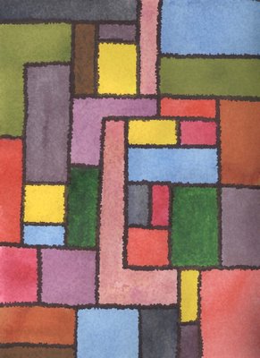
How to do a really perfect flat wash is still eluding me. It is too bad I missed class on Feb. 11 to go to a family Bat Mitzvah...not really too bad, the event was great. This rendition is still not good enough. It is interesting - I'll probably make some gretting cards out of it. But it is not good enough to complete the stained glass homework. I must say that I used up some cheapie paints on this practice and they are really not as good as the Windsor Newton Professional Watercolors. The Lowe Cornell paint is terrible, inconsistant and grainy. Don't buy it. Cotman paint is better but still doesn't work well for this project. I need to perfect this project and use all good paint. I think the cubist aproach is easier than the curved versions, but I LIKE the curved versions better.
Stained Glass Project II
This is a portion of the second stab at the Stained Glass Project that is due for homework on Saturday. I've done a larger version - different colors on Strathmore Aquarius paper. 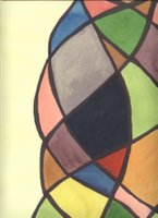
The other stained glass piece is done on Arches all Cotton paper. The Strathmore Aquarius is part cotton/part synthetic fiber. I really prefer the Arches all cotton for this project. My washes are still not flat as you can see. I'll have to do another pass at this on the Arches paper. I may go for more sqare/rectangular shapes becasue I suspect doing the flat washes may be a simpler task. I really would like a larger scanner, but that is not in the budget right now.

The other stained glass piece is done on Arches all Cotton paper. The Strathmore Aquarius is part cotton/part synthetic fiber. I really prefer the Arches all cotton for this project. My washes are still not flat as you can see. I'll have to do another pass at this on the Arches paper. I may go for more sqare/rectangular shapes becasue I suspect doing the flat washes may be a simpler task. I really would like a larger scanner, but that is not in the budget right now.
Thursday, February 16, 2006
Two Scarlet Tulips
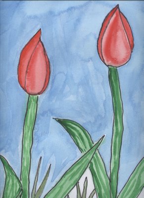
This is a portion of a larger painting of three tulips that is too large to scan. The tulips are based on my Cleveland Passover photograph which was the first art posting to this blog...scroll down to see it. Originally it had a grey background, I added the blue later which the homested critics think helps it a bit. I'm not super impressed by this painting myself. I was a bit torn about posting it. The tulips are a combination of cheapie Lowe Cornell Scarlet Paint and very nice quality Scarlet Lake paint by Windsor Newton. The paints are slightly different shades of Scarlet.
Wednesday, February 15, 2006
Stained Glass Project
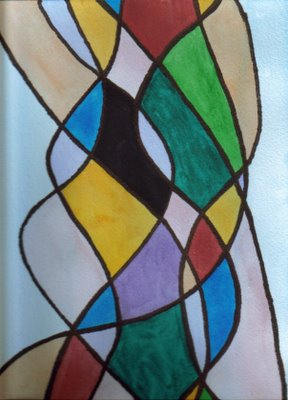
This is another stab at the Stained Glass project homework for the Fullerton College class. It is due in about ten days...I'm having some trouble making the washes truly flat and monochromatic. I like the color variation...but I'm doing this for a grade and there are criteria to meet. The black lines are sharpie - wide tip. My children (ages 12 and 8) really like this painting. They are not impressed by some of my artwork, so I really don't know why this appeals to them...perhaps it is the bright colors. I would really like to do a version of this that is much larger but then keeping the washes monochromatic would be even more difficult. I'm really happy with the colors that I'm getting with the more expensive Windsor Newton paint. This painting still has some of the cheaper Cotman paint in it, but it is mostly the good stuff. This is so different from everything else I've ever done that I'm interested to get some adult feedback.
Thursday, February 09, 2006
Cheap Joe's
I have become addicted to Cheap Joes Art Supplies: www.cheapjoes.com - The very expensive Windsor Newton Professiona Grade Watercolor Paint is MUCH LESS expensive there than at Aaron Brothers. I just got a very large tube of WN Scarlet Lake for $8.92 - This is far less than I would pay locally. This fabulous color wasn't even available at Aaron Brothers. Good quality paper is also way less at Cheap Joes than at the local stores. I'm trying out their own brand of watercolor paint in Phthalo Blue - since they didn't carry the WN kind. It was really a steal - a huge tube for $6.79. I see no reason to buy paint and paper anywhere else. I like to feel and hold brushes before I buy them, so I may still buy those locally. I have nearly every brush I need at the moment. But I will run out of paper and paint...I have created a WISH LIST at www.cheapjoes.com and I am happy to provide 8x10 prints of anything on the blog for the donation of a tube or two of paint. Just see the WISH LIST to know what colors I am using currently. Larger prints will require the donation of four or more tubes of paint since I have to put the files on a CD and take them out to a photo studio. Financial patronage of the arts is a longstanding tradition in all cultures.
Wednesday, February 08, 2006
Instructions for Valentine's Day Sachets
I'm sorry that I do not have a photo of my Valentine Sachets, I've given them all away. I made about 15 of them over the past three weeks. I used some pretty Polyester Brocades that I picked up for $9.99 a yard to make them. The basic instuctions are: fold the fabric in half, cut out a heart that is about 6-10 inches high. Then sew the heart 6/8 of the way around with the sewing machine. You will need to make a cut in the fabric up to the stitch line on the indent of the heart. Turn the fabric around. Mix up a few cups of cheap uncooked rice with your favorite perfume - you need to use quite a bit of perfume. Fill the sachet - I used a chinese soup spoon for this job. Then hand sew the opening in the heart. Everyone who I've given one just LOVES them.
Tuesday, February 07, 2006
California Poppies
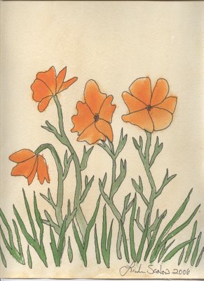
I've done a new scan of the California Poppies on my better Epson Scanner. Thanks to my husband for installing it. I'm not submitting this as my homework...see Stained Glass Project above. The original assignment was to do a Stained Glass watercolor - meaning there are black lines (fine line sharpie) around each block of color. As a child in Glendora, California I would always see these poppies - the state flower - growing wild on my walk to school. It was about time I did something with a California theme now that I have relocated. Many people have sent me e-mails commenting that they really like this piece. I like it too. I've made some greeting cards out of it.
Bat Mitzvah Program Cover
Subscribe to:
Comments (Atom)
